


Crowning Achievement: The Man Behind the Kansas City Royals’ Logo
December 7, 2011 by James Forr · 2 Comments

At Kauffman Stadium not long ago, someone introduced Shannon Manning to a fan and his young son. The boy had never heard of Manning and couldn’t understand why he was supposed to be so impressed. The father just pointed to his kid’s Royals cap and explained wryly, “Without this fellow, your hat would just be blue.”
Many of us waste years, decades, sometimes a lifetime, figuring out what we want to be when we grow up. But Shannon Manning yearned to be an artist for as long as he can remember; nothing else ever seriously crossed his mind. Even when he was a boy in rural Indiana, his parents could hand him a crayon and a stack of brown paper bags and he would be set for the evening. “It was something I could do as a kid that made me kind of special,” he recalled. “I wasn’t particularly good at sports. I wasn’t a particularly good student. But this was something I could do.”
Manning graduated from Herron School of Art and Design in Indianapolis, spent five years as a graphic designer in Chicago, and then in 1967 trekked off to Kansas City, where he took a job creating retail packaging for Hallmark.
That winter, shortly after the Athletics relocated to Oakland, baseball awarded Kansas City an expansion franchise. Owner Ewing Kauffman had no in-house design talent in those hectic early days, so for a team logo he turned to Hallmark and the hundreds of talented artists under its roof. Hallmark opened the project to its entire staff. Any employee who wanted to devise a logo could do so, on company time, with company resources. Although Manning was only a casual baseball fan, the artistic challenge intrigued him. “It was pretty much up my alley.”
The Royals had two requirements – they wanted to use blue and they insisted the logo incorporate a crown. Otherwise, Manning and his colleagues were free to go where their imaginations led them.
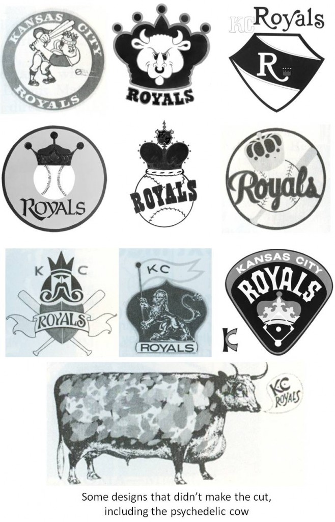
Twenty-one artists took a crack at it. Some concepts were straightforward (a simple crown perched squarely atop a baseball with the word “Royals” splayed across the seams). Others were more complex (crossed baseball bats and a shield beneath a fluttering “Royals” banner, all overseen by an imperious figure who vaguely resembled the King of Spades). And one design suggested a fanciful flight of Warholian whimsy. “There was a psychedelic cow,” Manning chuckled. “That was kind of a strange approach.”
Manning’s winning idea wove many disparate elements into a clean, elegant look. For the background, he chose what he described as, “a modified home plate shape that makes a shield, something that looks like a coat of arms.” Resting atop the shield was a gold crown. Inside the shield, the letters “KCR” featured swing-down, curving flourishes called swashes, which were au courant in the late 1960s. The “R” was a standard font but Manning modified an existing typeface to allow the “K” and the “C” to meld into each other seamlessly. Until 2002, that white “R” remained the focal point, with the gold “KC” rendered in smaller font and set off to the upper-right. (The club wanted to emphasize the nickname “Royals,” which was a nod to the American Royal, a livestock show, horse show, and rodeo that has been a fall tradition in Kansas City since 1899.)
Even after his design received the go-ahead, Manning still had to wrestle with the club over the nettlesome final details. “They kept trying to put images inside the ‘R,’ which was not a real good idea.” Those images included horse heads and cow heads, an homage to the American Royal and the famous Kansas City Stockyards.
But Manning argued that level of detail was impractical. “When you think about how this thing is reproduced, sometimes it’s huge and sometimes it’s very, very small. If you get a small object inside the loop of that ‘R,’ it’s going to be hard to reproduce in smaller sizes. So they did a wise thing and decided to leave all that stuff out, just use an ‘R,’ and let the simplicity of that design stand on its own. It just works better visually.”

The Royals have tweaked the logo over the years, eliminating the giant “R” and shifting the “KC” front and center. But the foundation of the design is still Manning’s. “The Royals’ logo is one of the best in all of sports, in my opinion,” proclaimed Curt Nelson, director of the Royals Hall of Fame. “If you silhouetted all the MLB logos to black, many of them would be difficult to distinguish from the others. Ours, however, would still stand out and be recognizable – simple, classic, and unique all at the same time.”
Manning, who retired from Hallmark more than a decade ago, never made a dime off the logo, but he has been compensated for it in other ways. Royals fans thanked him with a rousing ovation prior to the opening game in 1969, and the team awarded him four season tickets for that inaugural season. Even today, he can attend a game on the Royals’ tab anytime he wants. “I can’t tell you how many games I’ve been to and I’ve never bought a ticket.”
However, a more profound reward is the deep pride that comes from creating something important, enduring, and tangible. “There’s really not any higher way to make a contribution to your community than through your profession,” Manning attested. “When my wife and I came here it was more rural; people didn’t hustle and bustle quite as much. It was like coming home. So the ability to pay that back a little bit is something I’m really grateful for.”
Rejected designs courtesy Hallmark and the Kansas City Royals Hall of Fame.
Different iterations of the original logo are Shannon Manning originals, courtesy Kansas City Royals Hall of Fame.
James Forr’s book, Pie Traynor: A Baseball Biography (co-authored with David Proctor) was a finalist for the 2010 CASEY Award. He also was the 2005 winner of the McFarland-SABR Baseball Research Award.


Mr. Manning sounds like a wonderful man and an extraordinary talent. I am proud to say that I’m a a part of a small but talented community of team logo designers like Shannon, Todd Radom, Bill Frederick, Tom Froberg, Anne Occi, Dick Sakahara, Ken Shafer amongst others who’ve provided great sports identities that have stood the test of time.